Statistics is all about analyzing data to draw meaningful conclusions....
Understanding Descriptive Statistics Basics


1 / 4
1
of 4
Introduction to Descriptive Statistics
Ever wonder how scientists and researchers make sense of large amounts of information? It all starts with understanding statistics - the science of collecting and analyzing data. To work with statistics, you need to know the right terminology.
When studying a group, statisticians call the entire group a population, while a sample is just a subset of that population. When data is collected from everyone in a population, it's called a census, but gathering information from just a sample is called a survey.
Data can be categorized in two main ways: discrete and continuous. Discrete data involves exact counting values (like the number of students in a class), while continuous data involves measurements within ranges (like height or weight).
Quick Tip: Remember that discrete data can be counted (like people in a car), while continuous data is measured (like your height). This distinction will help you decide how to organize and display your data!
2
of 4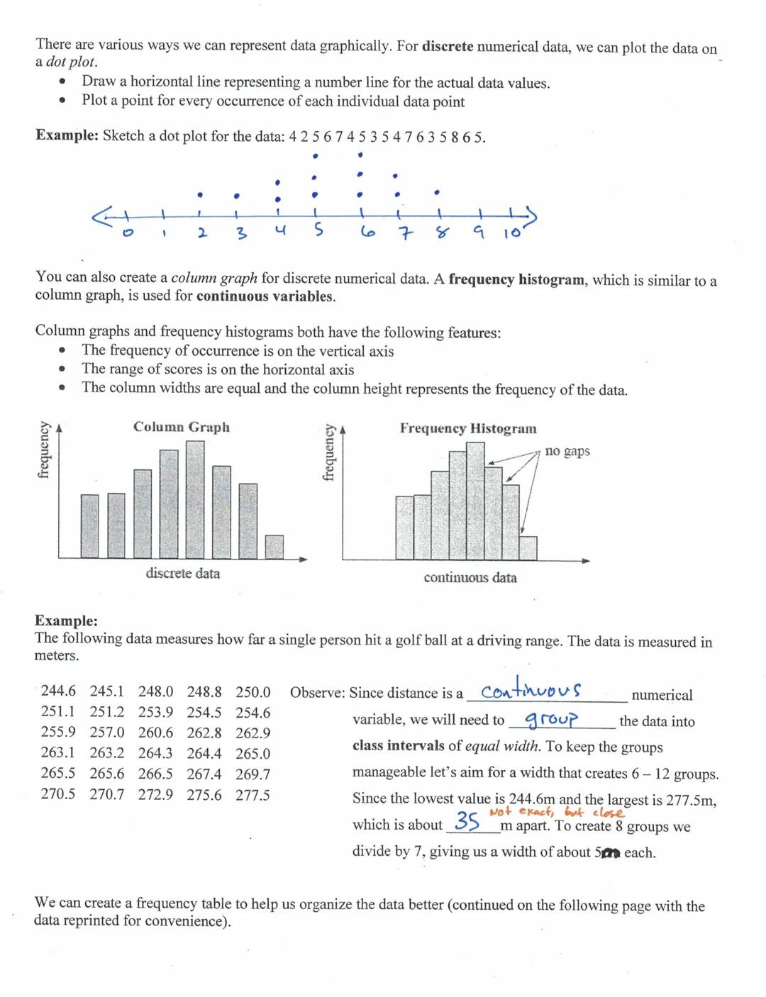
Representing Data Graphically
Data visualization helps you spot patterns that might be hidden in rows of numbers. For discrete numerical data, you can create dot plots by plotting a point for each occurrence of a value on a number line. This gives you a quick visual of how the data is distributed.
Another way to display discrete data is with a column graph, which shows frequency on the vertical axis and data values on the horizontal axis. For continuous data, we use frequency histograms instead, which look similar but have no gaps between columns because the data represents ranges rather than exact values.
The main difference between these graphs is that column graphs (for discrete data) have gaps between columns, while histograms (for continuous data) don't have gaps since they represent continuous ranges of values.
Remember: When working with continuous data like measurements, you'll need to group values into intervals of equal width to create a meaningful histogram. Aim for 6-12 groups to make your data manageable!
3
of 4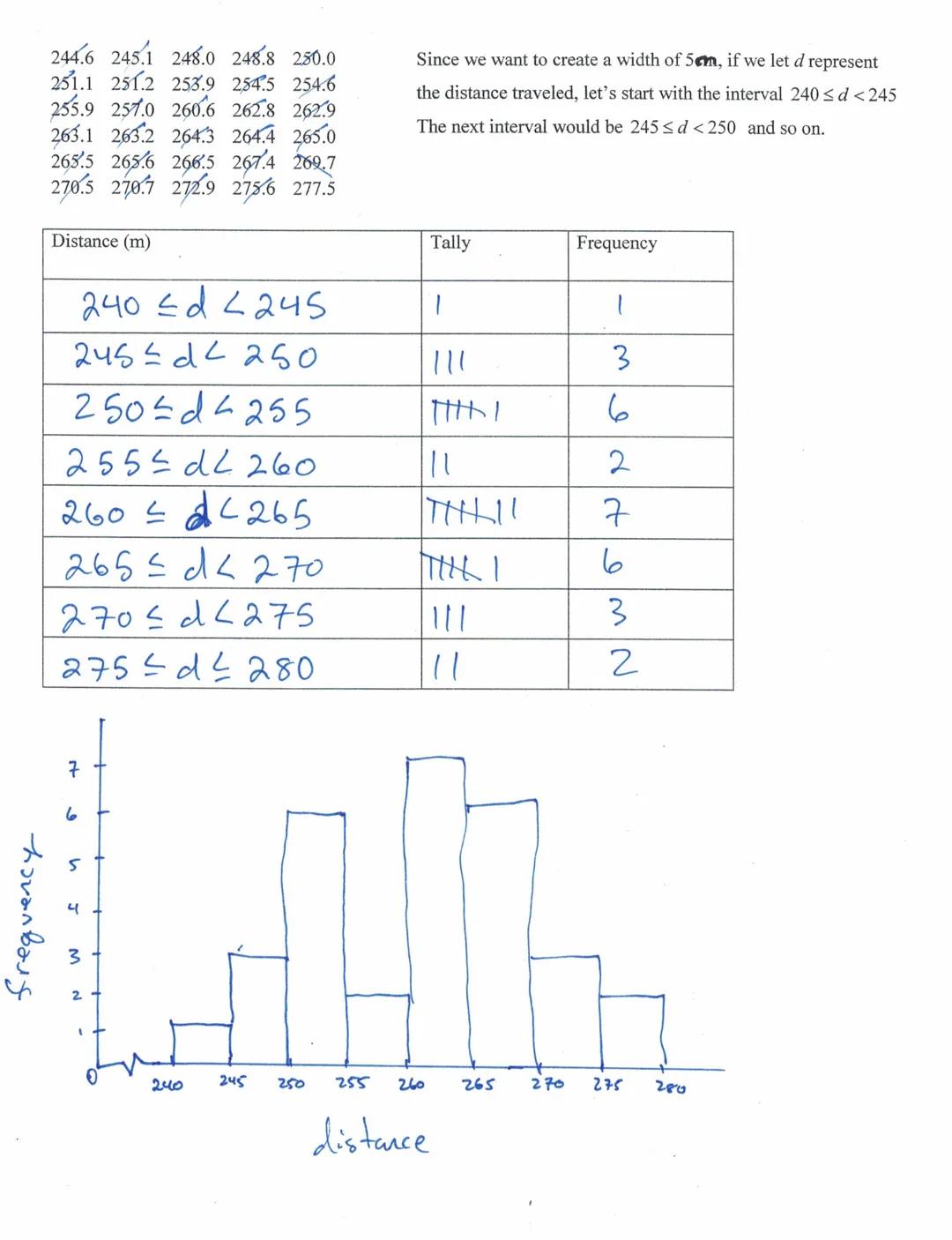
Creating Frequency Tables and Histograms
When organizing continuous data like distances or measurements, you'll need to group values into intervals. For example, with golf ball distances ranging from 244.6m to 277.5m, you might create equal intervals of 5m each.
To create a frequency table, first determine your intervals (like 240≤d<245, 245≤d<250, etc.). Then count how many data points fall into each interval. This organized approach helps you see the distribution of your data before creating a visual representation.
After completing your frequency table, you can create a histogram by drawing columns whose heights represent the frequency of each interval. The resulting graph gives you a visual representation of how your data is distributed.
Visual Check: Does your histogram show a pattern? Look for whether the data is symmetrical, skewed to the right (positive skew), or skewed to the left (negative skew). This tells you important information about your dataset!
4
of 4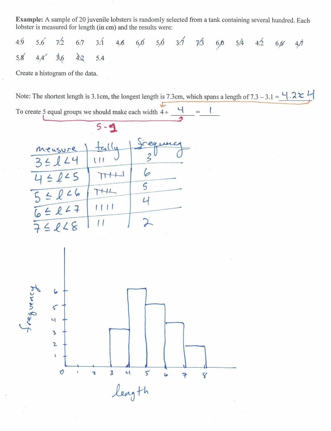
Working With Sample Data
Real-world statistics often involves working with sample data to draw conclusions. For example, when measuring the length of 20 juvenile lobsters from a tank of hundreds, you're using a sample to understand the whole population.
When creating a histogram for continuous data like lobster lengths (ranging from 3.1cm to 7.3cm), first determine an appropriate interval width. For a span of about 4cm and wanting 5 equal groups, each interval should be about 1cm wide.
Once you've organized your data into intervals and counted the frequency for each, your histogram will reveal patterns in the data. This might show you whether lobster lengths are evenly distributed or if certain size ranges are more common.
Application Tip: When analyzing data for a science project or assignment, always consider what your histogram's shape tells you. A symmetrical distribution might indicate natural variation, while a skewed distribution could suggest something interesting is happening in your sample!
We thought you’d never ask...
Our AI companion is specifically built for the needs of students. Based on the millions of content pieces we have on the platform we can provide truly meaningful and relevant answers to students. But its not only about answers, the companion is even more about guiding students through their daily learning challenges, with personalised study plans, quizzes or content pieces in the chat and 100% personalisation based on the students skills and developments.
You can download the app in the Google Play Store and in the Apple App Store.
That's right! Enjoy free access to study content, connect with fellow students, and get instant help – all at your fingertips.
Similar Content
Most popular content in Algebra 1
9M
Mastering Algebra 1: Essential Flashcards
Learn key concepts of Algebra 1 with these flashcards. Explore slope-intercept form, properties, equations, and expressions. Boost your math skills and ace your exams!
8th1821
7
7th Grade Math
Algebra 1 and all of the other stuff
7th4264
Rules of Integer Operations
Learn the rules for adding, subtracting, multiplying, and dividing integers, along with examples and definitions of positive and negative integers.
9th560
Integer Rules
A review of Integer concepts and how to solve integers
1824
Combining like terms in expressions.
Learn how to identify and combine like terms in algebraic expressions to simplify equations.
9th1860
Expressions and Operations
Algebra 1 - unit 1 - covers: integer rules, order of operations, evaluating algerbraic expressions, simplifying algebraic expressions, and translating expressions.
9th1,46695
W
wizards
Mathematics is the most loved and also the most feared subjects by students across the world. Have you been worrying about your upcoming math test? Practice these 30 maths quiz questions to ensure you are at the top of your game!
1000
Interior and exterior angle measures
Interior and exterior angle measures practice
9th2721
solving systems of linear equations by graphing
objectives: students will check solutions of systems of linear equations. students will solve linear equations by graphing.
942
Most popular content
9O
Origins and Dynamics of the Columbian Exchange
Analyze the ecological and economic motivations behind the initial transfer of goods, people, and diseases between the Old and New Worlds.
9th3,1280
I
Introduction to Early Cultural Interactions
Analyze the initial social and religious encounters between Europeans, Africans, and Indigenous peoples in the colonial Americas.
9th2,7730
O
Origins of Ancient River Civilizations
Analyze the environmental factors and technological innovations that led to the rise of early states in Mesopotamia, Egypt, and the Indus Valley.
9th3,1870
M
Motivations for European Exploration
Analyze the economic, religious, and political factors that drove European powers to the Americas during the 15th and 16th centuries.
9th1,7780
F
Foundations of Ethical Guidelines in Research
Practice the core principles of the APA ethical code including informed consent, debriefing, and the role of Institutional Review Boards.
9th1,3360
I
Introduction to Native American Societies
Examine the diverse social, political, and economic structures of North American indigenous groups prior to European contact.
9th1,1100
I
Introduction to the Spanish Encomienda System
Explore the fundamental economic and social structures of the Spanish colonial system, focusing on the encomienda and the casta social hierarchy.
9th8890
I
Introduction to Biological Elements of Life
Practice identifying the essential elements including carbon, nitrogen, phosphorus, and sulfur that compose biological macromolecules.
9th1,7410
O
Origins of the Articles of Confederation
Practice identifying the motivations for a weak central government and the specific powers granted to the states under the first U.S. constitution.
9th9370
Students love us — and so will you.
4.6/5App Store
4.7/5Google Play
The app is very easy to use and well designed. I have found everything I was looking for so far and have been able to learn a lot from the presentations! I will definitely use the app for a class assignment! And of course it also helps a lot as an inspiration.
Stefan SiOS user
This app is really great. There are so many study notes and help [...]. My problem subject is French, for example, and the app has so many options for help. Thanks to this app, I have improved my French. I would recommend it to anyone.
Samantha KlichAndroid user
Wow, I am really amazed. I just tried the app because I've seen it advertised many times and was absolutely stunned. This app is THE HELP you want for school and above all, it offers so many things, such as workouts and fact sheets, which have been VERY helpful to me personally.
AnnaiOS user
Understanding Descriptive Statistics Basics
Statistics is all about analyzing data to draw meaningful conclusions. Whether you're working with population-wide information or just a sample, understanding how to organize, represent, and interpret numerical data is an essential skill that helps us make sense of the...
1
of 4
Sign up to see the content. It's free!
- Access to all documents
- Improve your grades
- Join milions of students
Introduction to Descriptive Statistics
Ever wonder how scientists and researchers make sense of large amounts of information? It all starts with understanding statistics - the science of collecting and analyzing data. To work with statistics, you need to know the right terminology.
When studying a group, statisticians call the entire group a population, while a sample is just a subset of that population. When data is collected from everyone in a population, it's called a census, but gathering information from just a sample is called a survey.
Data can be categorized in two main ways: discrete and continuous. Discrete data involves exact counting values (like the number of students in a class), while continuous data involves measurements within ranges (like height or weight).
Quick Tip: Remember that discrete data can be counted (like people in a car), while continuous data is measured (like your height). This distinction will help you decide how to organize and display your data!
2
of 4Sign up to see the content. It's free!
- Access to all documents
- Improve your grades
- Join milions of students
Representing Data Graphically
Data visualization helps you spot patterns that might be hidden in rows of numbers. For discrete numerical data, you can create dot plots by plotting a point for each occurrence of a value on a number line. This gives you a quick visual of how the data is distributed.
Another way to display discrete data is with a column graph, which shows frequency on the vertical axis and data values on the horizontal axis. For continuous data, we use frequency histograms instead, which look similar but have no gaps between columns because the data represents ranges rather than exact values.
The main difference between these graphs is that column graphs (for discrete data) have gaps between columns, while histograms (for continuous data) don't have gaps since they represent continuous ranges of values.
Remember: When working with continuous data like measurements, you'll need to group values into intervals of equal width to create a meaningful histogram. Aim for 6-12 groups to make your data manageable!
3
of 4Sign up to see the content. It's free!
- Access to all documents
- Improve your grades
- Join milions of students
Creating Frequency Tables and Histograms
When organizing continuous data like distances or measurements, you'll need to group values into intervals. For example, with golf ball distances ranging from 244.6m to 277.5m, you might create equal intervals of 5m each.
To create a frequency table, first determine your intervals (like 240≤d<245, 245≤d<250, etc.). Then count how many data points fall into each interval. This organized approach helps you see the distribution of your data before creating a visual representation.
After completing your frequency table, you can create a histogram by drawing columns whose heights represent the frequency of each interval. The resulting graph gives you a visual representation of how your data is distributed.
Visual Check: Does your histogram show a pattern? Look for whether the data is symmetrical, skewed to the right (positive skew), or skewed to the left (negative skew). This tells you important information about your dataset!
4
of 4Sign up to see the content. It's free!
- Access to all documents
- Improve your grades
- Join milions of students
Working With Sample Data
Real-world statistics often involves working with sample data to draw conclusions. For example, when measuring the length of 20 juvenile lobsters from a tank of hundreds, you're using a sample to understand the whole population.
When creating a histogram for continuous data like lobster lengths (ranging from 3.1cm to 7.3cm), first determine an appropriate interval width. For a span of about 4cm and wanting 5 equal groups, each interval should be about 1cm wide.
Once you've organized your data into intervals and counted the frequency for each, your histogram will reveal patterns in the data. This might show you whether lobster lengths are evenly distributed or if certain size ranges are more common.
Application Tip: When analyzing data for a science project or assignment, always consider what your histogram's shape tells you. A symmetrical distribution might indicate natural variation, while a skewed distribution could suggest something interesting is happening in your sample!
We thought you’d never ask...
Our AI companion is specifically built for the needs of students. Based on the millions of content pieces we have on the platform we can provide truly meaningful and relevant answers to students. But its not only about answers, the companion is even more about guiding students through their daily learning challenges, with personalised study plans, quizzes or content pieces in the chat and 100% personalisation based on the students skills and developments.
You can download the app in the Google Play Store and in the Apple App Store.
That's right! Enjoy free access to study content, connect with fellow students, and get instant help – all at your fingertips.
Similar Content
Most popular content in Algebra 1
9M
Mastering Algebra 1: Essential Flashcards
Learn key concepts of Algebra 1 with these flashcards. Explore slope-intercept form, properties, equations, and expressions. Boost your math skills and ace your exams!
8th1821
7
7th Grade Math
Algebra 1 and all of the other stuff
7th4264
Rules of Integer Operations
Learn the rules for adding, subtracting, multiplying, and dividing integers, along with examples and definitions of positive and negative integers.
9th560
Integer Rules
A review of Integer concepts and how to solve integers
1824
Combining like terms in expressions.
Learn how to identify and combine like terms in algebraic expressions to simplify equations.
9th1860
Expressions and Operations
Algebra 1 - unit 1 - covers: integer rules, order of operations, evaluating algerbraic expressions, simplifying algebraic expressions, and translating expressions.
9th1,46695
W
wizards
Mathematics is the most loved and also the most feared subjects by students across the world. Have you been worrying about your upcoming math test? Practice these 30 maths quiz questions to ensure you are at the top of your game!
1000
Interior and exterior angle measures
Interior and exterior angle measures practice
9th2721
solving systems of linear equations by graphing
objectives: students will check solutions of systems of linear equations. students will solve linear equations by graphing.
942
Most popular content
9O
Origins and Dynamics of the Columbian Exchange
Analyze the ecological and economic motivations behind the initial transfer of goods, people, and diseases between the Old and New Worlds.
9th3,1280
I
Introduction to Early Cultural Interactions
Analyze the initial social and religious encounters between Europeans, Africans, and Indigenous peoples in the colonial Americas.
9th2,7730
O
Origins of Ancient River Civilizations
Analyze the environmental factors and technological innovations that led to the rise of early states in Mesopotamia, Egypt, and the Indus Valley.
9th3,1870
M
Motivations for European Exploration
Analyze the economic, religious, and political factors that drove European powers to the Americas during the 15th and 16th centuries.
9th1,7780
F
Foundations of Ethical Guidelines in Research
Practice the core principles of the APA ethical code including informed consent, debriefing, and the role of Institutional Review Boards.
9th1,3360
I
Introduction to Native American Societies
Examine the diverse social, political, and economic structures of North American indigenous groups prior to European contact.
9th1,1100
I
Introduction to the Spanish Encomienda System
Explore the fundamental economic and social structures of the Spanish colonial system, focusing on the encomienda and the casta social hierarchy.
9th8890
I
Introduction to Biological Elements of Life
Practice identifying the essential elements including carbon, nitrogen, phosphorus, and sulfur that compose biological macromolecules.
9th1,7410
O
Origins of the Articles of Confederation
Practice identifying the motivations for a weak central government and the specific powers granted to the states under the first U.S. constitution.
9th9370
Students love us — and so will you.
4.6/5App Store
4.7/5Google Play
The app is very easy to use and well designed. I have found everything I was looking for so far and have been able to learn a lot from the presentations! I will definitely use the app for a class assignment! And of course it also helps a lot as an inspiration.
Stefan SiOS user
This app is really great. There are so many study notes and help [...]. My problem subject is French, for example, and the app has so many options for help. Thanks to this app, I have improved my French. I would recommend it to anyone.
Samantha KlichAndroid user
Wow, I am really amazed. I just tried the app because I've seen it advertised many times and was absolutely stunned. This app is THE HELP you want for school and above all, it offers so many things, such as workouts and fact sheets, which have been VERY helpful to me personally.
AnnaiOS user