Data visualization helps us make sense of numbers by turning...
Understanding Different Types of Graphs


1 / 10
1
of 10
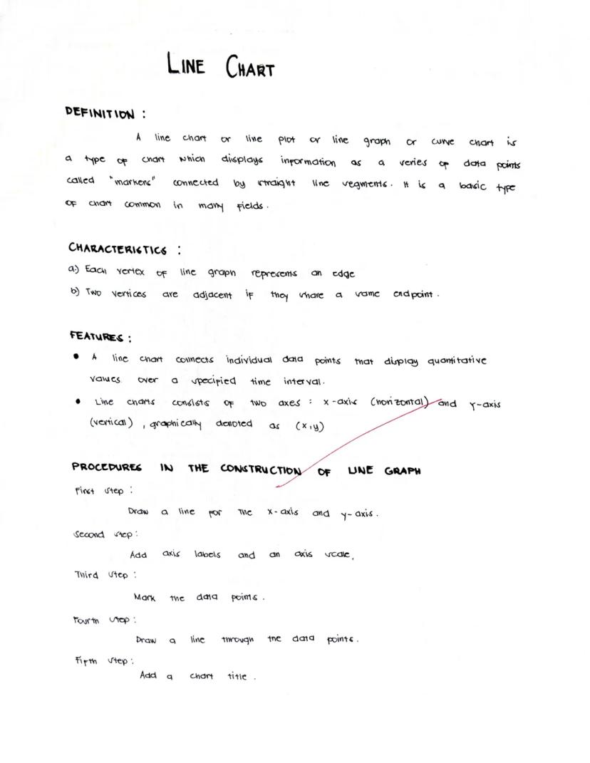
Line Charts
Line charts connect data points with lines to show how values change over time or across a sequence. These charts make it super easy to spot trends, patterns, and changes in your data.
A line chart has two main axes: the x-axis (horizontal) and y-axis (vertical). Each point on the chart represents a specific data value at a specific moment, like a temperature reading on a particular day.
Creating a line chart is straightforward:
- Draw and label your x and y axes
- Plot your data points at the correct positions
- Connect the points with lines
- Add a clear title that explains what your chart shows
Quick Tip: Line charts are perfect for showing how things change over time - like tracking your test scores throughout the semester or how temperatures rise and fall across seasons.
When you look at a line chart, focus on the overall direction. Is the line going up (increasing trend), going down (decreasing trend), or does it fluctuate up and down (variable pattern)?
2
of 10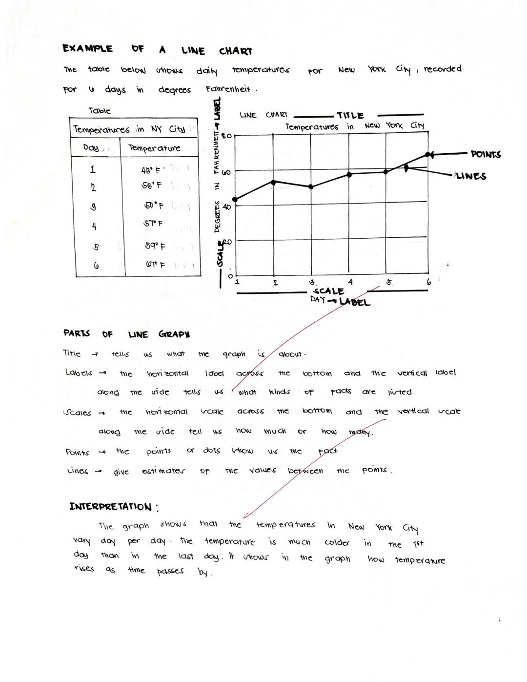
Reading Line Charts
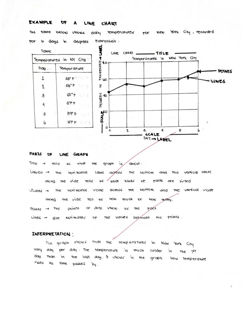
Line charts tell stories with their shapes and patterns. Let's see how to read one using a real example about temperatures in New York City over six days.
The line chart has clear parts that help us understand the data:
- The title tells us what we're looking at ("Temperatures in New York City")
- Labels on each axis explain what the numbers represent (days on the x-axis and temperature in Fahrenheit on the y-axis)
- The scale shows us the range of values
- Points mark each actual measurement
- Lines connect the points and help us estimate values between measurements
Looking at the example chart, we can see that temperatures started cold on day 1 (43°F) but generally increased over time, ending much warmer on day 6 (67°F).
Pro Reading Skill: When interpreting a line chart, look for the highest and lowest points, the overall trend direction, and any unusual changes or patterns that might need explanation.
The beauty of line charts is that they let you see the whole story of your data at once, making it easy to understand changes over time.
3
of 10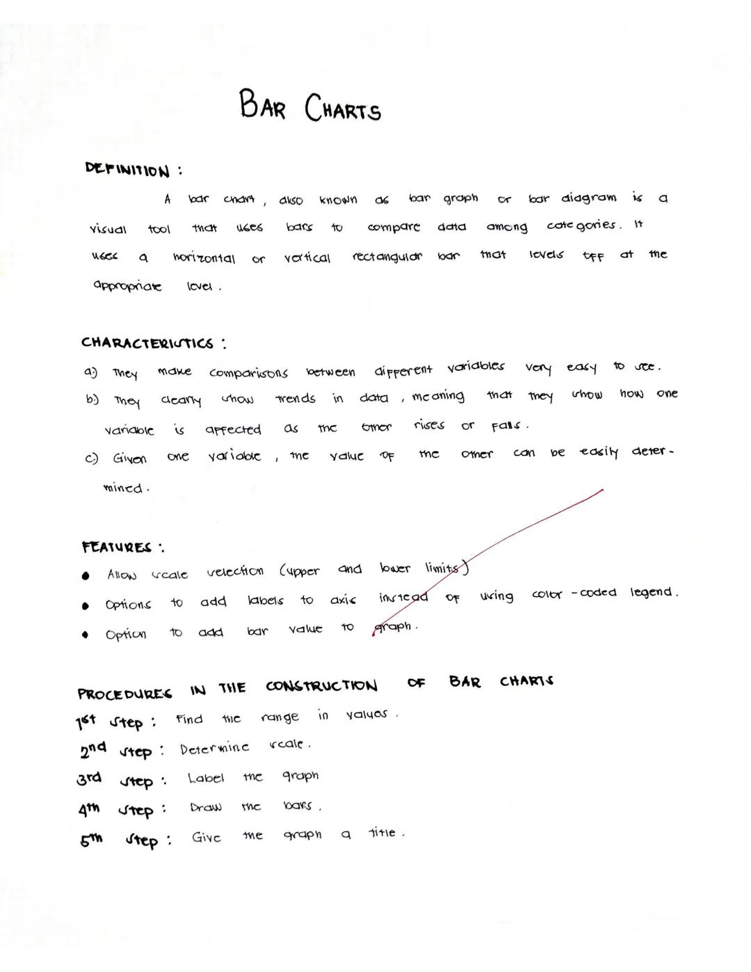
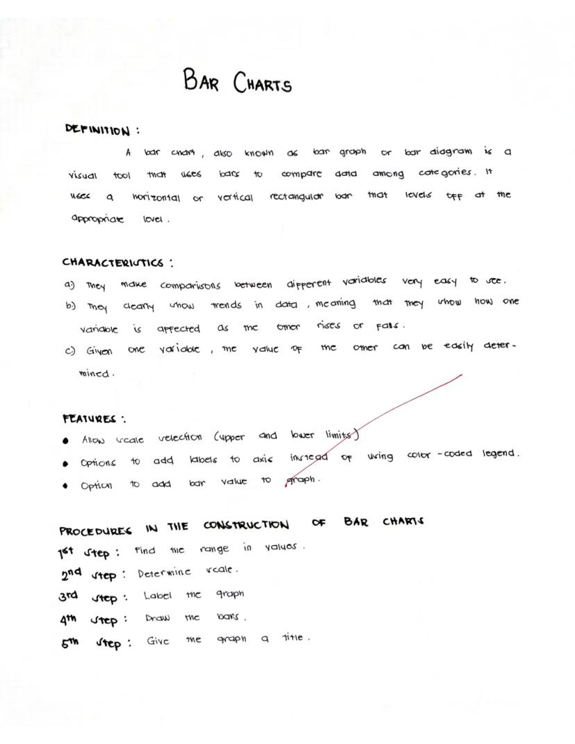
Bar Charts
Bar charts use rectangular bars to compare different categories of data. Whether displayed horizontally or vertically, the length of each bar shows the value it represents, making comparisons super clear at a glance.
What makes bar charts awesome:
- They make comparing different items or categories really easy
- They clearly reveal trends in your data
- You can quickly find specific values by looking at the bar heights
Creating a bar chart is simple:
- Find the range of your values
- Determine your scale (how much each unit on your chart represents)
- Label your axes clearly
- Draw bars of the appropriate height/length
- Give your chart a descriptive title
Chart Pro Tip: Bar charts are your go-to choice when comparing different categories that don't have a natural order - like comparing popularity of different sports or sales across different store locations.
Bar charts can be customized with different colors, labels on the bars themselves, and various scale options to make your data even easier to understand.
4
of 10
Reading Bar Charts
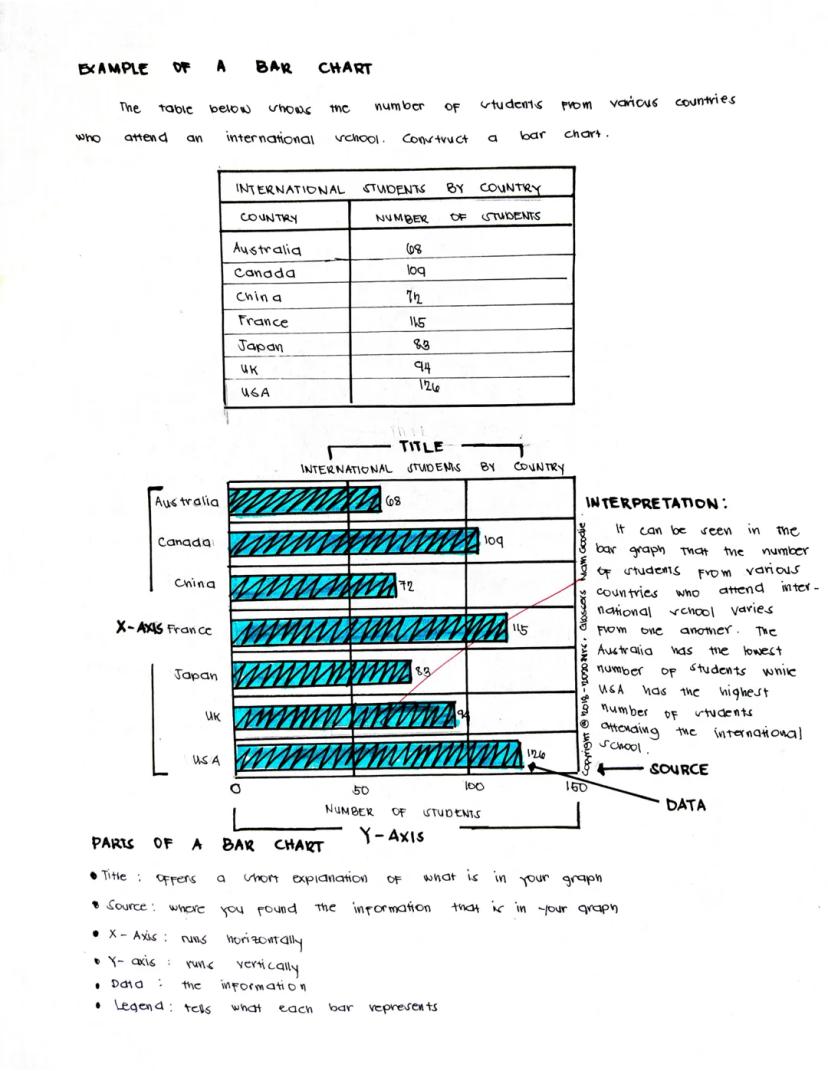
Bar charts present data in a way that's immediately visual and easy to compare. Let's examine an example showing international students by country at a school.
A complete bar chart has several key components:
- The title explains what the chart shows ("International Students by Country")
- The x-axis (horizontal) typically shows the categories being compared
- The y-axis (vertical) shows the scale of values
- The data bars represent the actual values (taller bars = higher numbers)
- A legend may explain what different colors or patterns represent
- The source tells where the data came from
In our example chart, we can quickly see that the USA has the highest number of international students (126), followed by France (115) and Canada (109). Australia has the fewest students (68) among the countries shown.
Reading Insight: When analyzing a bar chart, always look for the biggest and smallest values first, then see if there are any natural groupings or patterns in the middle values.
Bar charts make it easy to make quick comparisons between different categories, which is why they're one of the most common and useful chart types you'll encounter.
5
of 10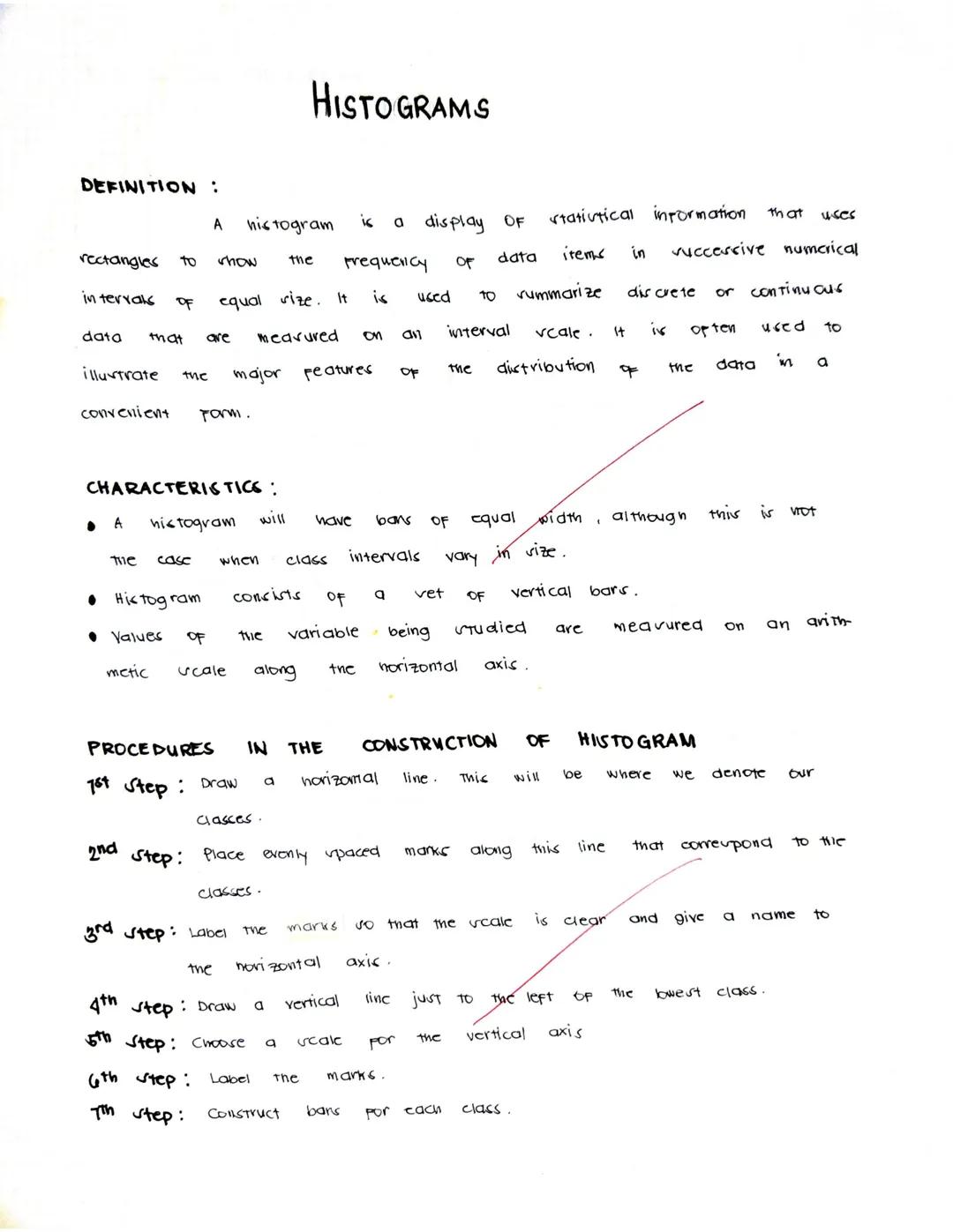
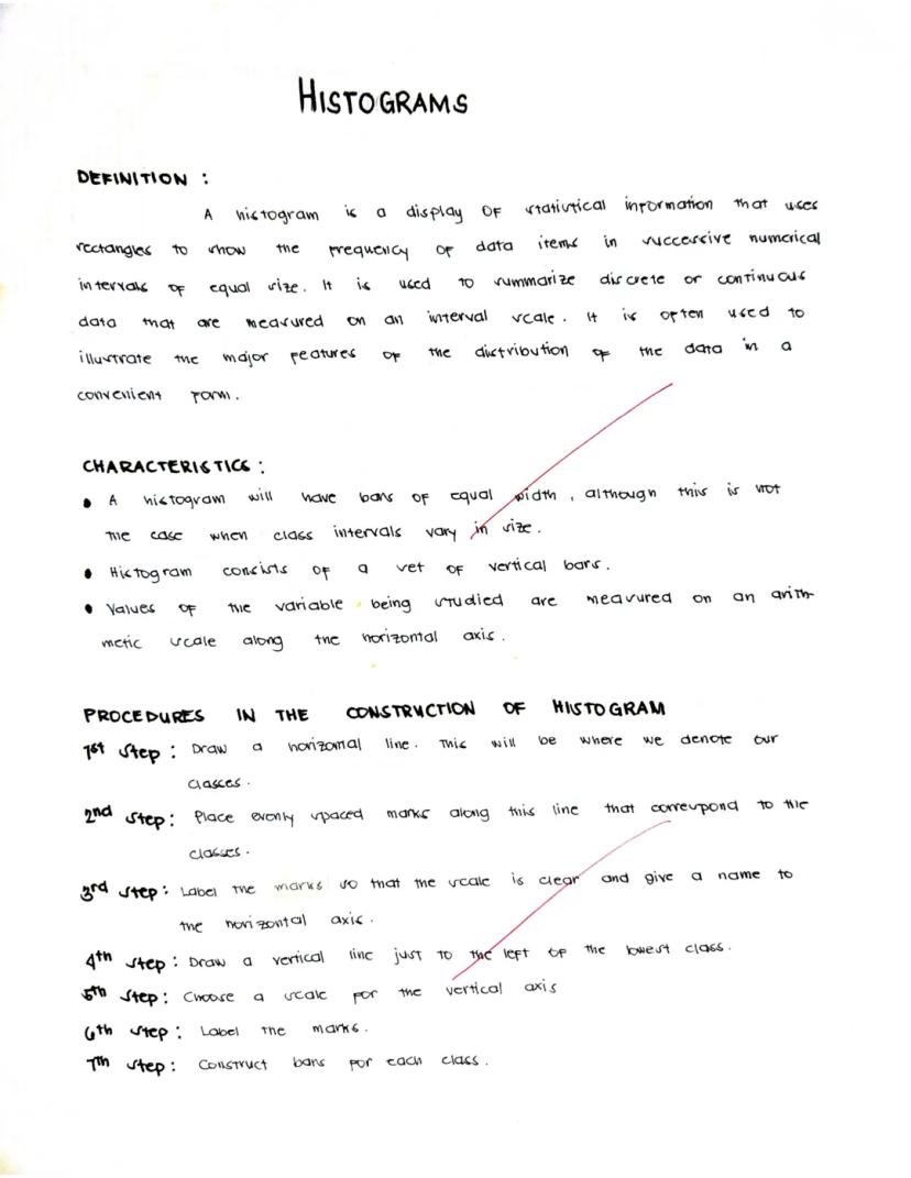
Histograms
A histogram looks similar to a bar chart but serves a different purpose - it shows the distribution of continuous data across intervals. Think of it as showing how frequently data falls within certain ranges or "bins."
Histograms are particularly useful for:
- Summarizing large sets of continuous measurements
- Showing the shape of data distribution (is it evenly spread out, clustered in the middle, or skewed to one side?)
- Identifying outliers or unusual patterns in your data
Creating a histogram involves these steps:
- Draw and label a horizontal line for your classes (data ranges)
- Mark evenly spaced intervals along this line
- Clearly label these marks and the horizontal axis
- Draw a vertical line at the left edge and choose a scale
- Label the vertical axis (which shows frequency)
- Create bars for each class showing how many data points fall in that range
Data Detective Hint: Unlike bar charts where gaps between bars are normal, histogram bars touch each other to show that the data is continuous - there are no gaps in the possible values.
Histograms help you see patterns in data that might otherwise be hidden in a simple list of numbers.
6
of 10
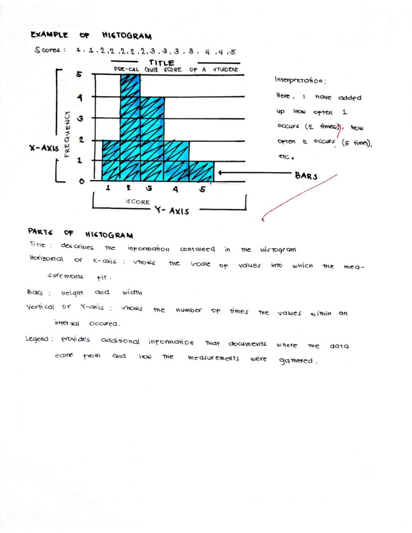
Reading Histograms
Histograms reveal patterns in how your data is distributed across different values. Let's look at an example showing Pre-Calculus quiz scores.
A well-designed histogram includes:
- A descriptive title ("Pre-Cal Quiz Score of a Student")
- The x-axis showing the range of possible values (scores 1-5)
- The y-axis showing frequency (how many times each score occurred)
- Bars whose heights show the frequency of each value or range
In our example, we can see that the student received a score of 2 most frequently (5 times), followed by a score of 3 (3 times). The student received scores of 1, 4, and 5 less frequently.
Histogram Insight: The shape of a histogram tells you a lot! A "bell curve" means most values cluster in the middle. A "skewed" shape (higher on one side) shows that values tend toward one end of the range.
When interpreting a histogram, pay attention to where the data clusters and where there are gaps. This example shows the student most often scores in the 2-3 range, suggesting consistent but not excellent performance.
7
of 10
Pie Charts
Pie charts use circular "slices" to show how different parts contribute to a whole. Each slice represents a percentage or proportion of the total, making it easy to see which categories make up larger or smaller portions of your data.
Pie charts work best when:
- You want to show percentages or proportions
- You have a small number of categories (fewer than six is ideal)
- You're more interested in the relationship of parts to the whole than in exact values
Creating a pie chart involves these key steps:
- Calculate the central angle for each component (using the formula: component value ÷ total value × 360°)
- Draw a circle
- Starting with the horizontal radius, draw radii that create the appropriate central angles
- Repeat for all components
- Label each sector clearly, typically with both the category name and percentage
Visualization Tip: Pie charts give an immediate visual impression of which categories dominate, but they're not great for showing small differences between values or for comparing many categories.
Remember that the entire pie always represents 100% of whatever you're measuring, so every data point must be included somewhere in the chart.
8
of 10
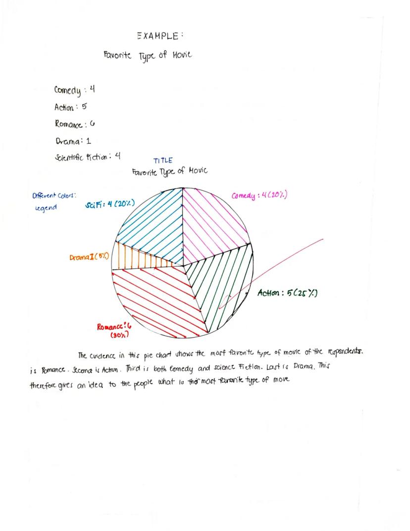
Reading Pie Charts
A pie chart instantly shows which categories take up the biggest "slice" of the whole. Let's examine an example about favorite types of movies.
A complete pie chart includes:
- A clear title ("Favorite Type of Movie")
- Different colored sections representing each category
- A legend explaining what each color represents, typically with numbers and percentages
- Labels that may appear directly on the slices or in the legend
In our example, Romance is the most popular movie type at 30% (6 votes), followed by Action at 25% (5 votes). Comedy and Science Fiction tie for third place at 20% each (4 votes each), while Drama is least popular at just 5% (1 vote).
Chart Reading Strategy: When looking at a pie chart, first identify the largest and smallest slices to get a quick sense of what dominates and what's least significant in your data.
Pie charts are excellent for showing proportional relationships and giving a quick visual impression of which categories dominate in your data. In this example, it's clear that Romance and Action films together account for over half of all preferences.
9
of 10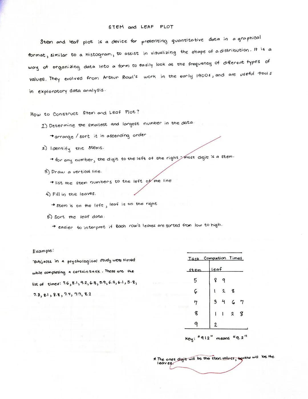
Stem and Leaf Plots
Stem and leaf plots organize numerical data to show both the overall distribution and the actual values. Think of it as a histogram where you can still see the original numbers, making it perfect for smaller data sets.
A stem and leaf plot works by:
- Dividing each number into a "stem" (the digit to the left of the rightmost digit) and a "leaf" (the rightmost digit)
- Listing all stems in a column on the left side of a vertical line
- Placing each corresponding leaf on the right side of the line
Creating a stem and leaf plot involves:
- Determine the smallest and largest numbers and arrange data in ascending order
- Identify the stems (all digits except the rightmost)
- Draw a vertical line and list stems to the left
- Add leaves to the right of the line
- Sort leaves from low to high in each row for easier interpretation
In the example showing task completion times (5.8, 5.9, 6.1, etc.), the stems are 5, 6, 7, 8, and 9, while the leaves are the tenths digits.
Quick Data Insight: Stem and leaf plots let you see the shape of your data distribution while preserving the actual values - something most other charts can't do!
The completed plot makes it easy to see clusters and patterns in your data, like which completion times were most common.
10
of 10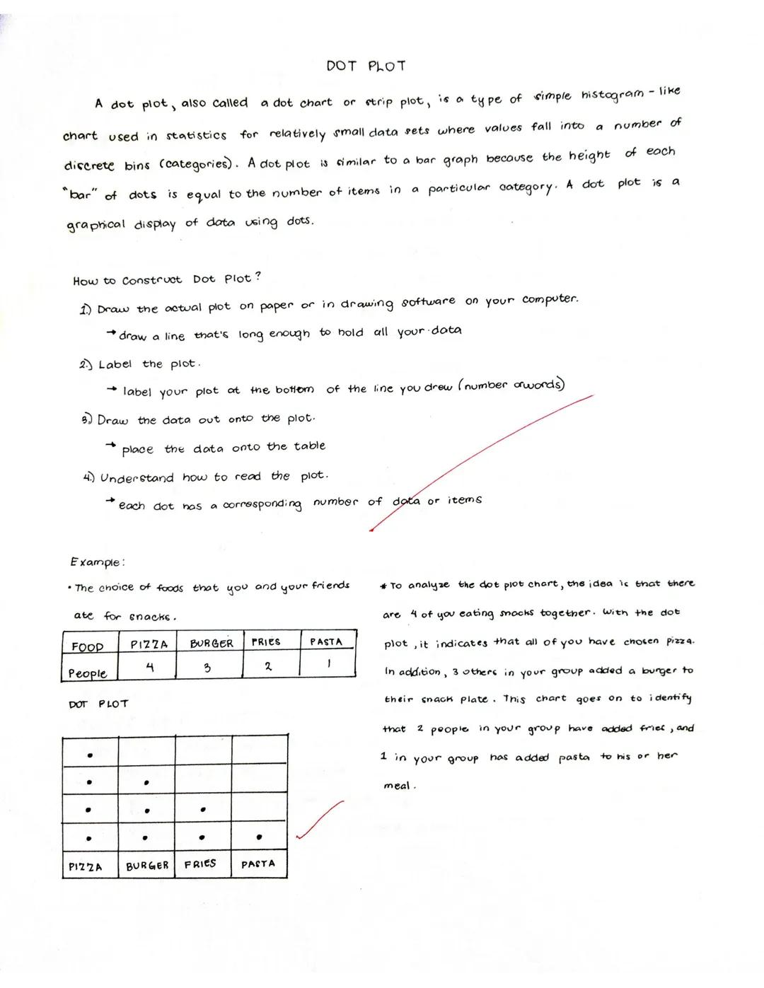
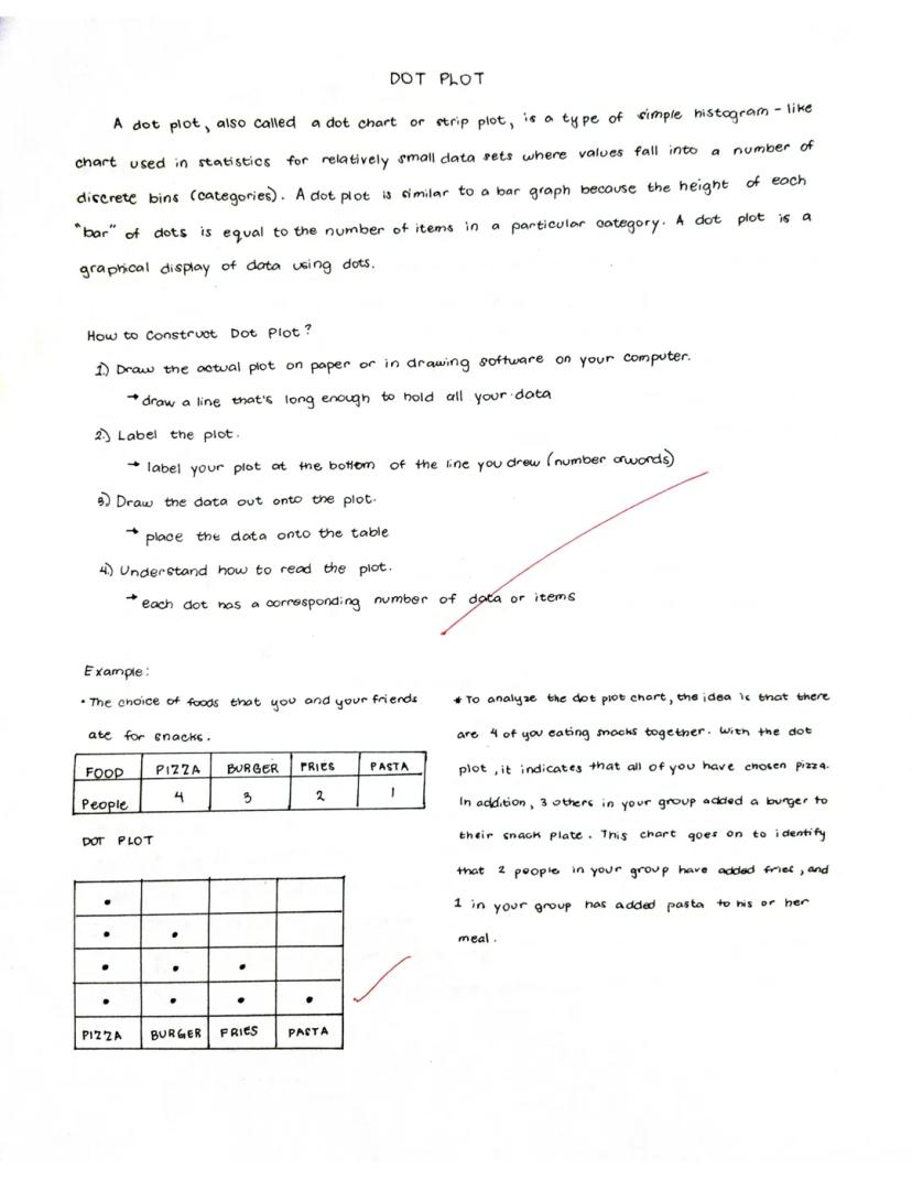
Dot Plots
Dot plots use dots to show the frequency of values in a data set. Each dot represents one observation, and dots stack up to show how many times each value appears in your data.
Dot plots are great for:
- Showing distributions of relatively small data sets
- Making it easy to see the most common values
- Comparing frequencies across different categories
Creating a dot plot is simple:
- Draw a line long enough to hold all your categories or values
- Label the line with your categories or number scale
- Place a dot above each label for each time that value appears in your data
- Stack dots vertically when the same value occurs multiple times
In the food example, four friends chose pizza for snacks, three chose burgers, two chose fries, and one chose pasta. Each dot represents one person's choice.
Visualization Secret: Dot plots show you exactly how many items fall into each category, making them more precise than bar charts for small data sets while being easier to create by hand.
When reading a dot plot, focus on where the dots cluster (most popular) and where there are few or no dots (least popular). In our example, pizza is clearly the favorite snack, while pasta is the least popular.
We thought you’d never ask...
Our AI companion is specifically built for the needs of students. Based on the millions of content pieces we have on the platform we can provide truly meaningful and relevant answers to students. But its not only about answers, the companion is even more about guiding students through their daily learning challenges, with personalised study plans, quizzes or content pieces in the chat and 100% personalisation based on the students skills and developments.
You can download the app in the Google Play Store and in the Apple App Store.
That's right! Enjoy free access to study content, connect with fellow students, and get instant help – all at your fingertips.
Similar Content
Most popular content: Histograms
1Most popular content in Math (ACT®)
1Most popular content
9O
Origins and Dynamics of the Columbian Exchange
Analyze the ecological and economic motivations behind the initial transfer of goods, people, and diseases between the Old and New Worlds.
9th3,1280
I
Introduction to Early Cultural Interactions
Analyze the initial social and religious encounters between Europeans, Africans, and Indigenous peoples in the colonial Americas.
9th2,7730
O
Origins of Ancient River Civilizations
Analyze the environmental factors and technological innovations that led to the rise of early states in Mesopotamia, Egypt, and the Indus Valley.
9th3,1870
M
Motivations for European Exploration
Analyze the economic, religious, and political factors that drove European powers to the Americas during the 15th and 16th centuries.
9th1,7780
F
Foundations of Ethical Guidelines in Research
Practice the core principles of the APA ethical code including informed consent, debriefing, and the role of Institutional Review Boards.
9th1,3360
I
Introduction to Native American Societies
Examine the diverse social, political, and economic structures of North American indigenous groups prior to European contact.
9th1,1100
I
Introduction to the Spanish Encomienda System
Explore the fundamental economic and social structures of the Spanish colonial system, focusing on the encomienda and the casta social hierarchy.
9th8890
I
Introduction to Biological Elements of Life
Practice identifying the essential elements including carbon, nitrogen, phosphorus, and sulfur that compose biological macromolecules.
9th1,7410
O
Origins of the Articles of Confederation
Practice identifying the motivations for a weak central government and the specific powers granted to the states under the first U.S. constitution.
9th9370
Students love us — and so will you.
4.6/5App Store
4.7/5Google Play
The app is very easy to use and well designed. I have found everything I was looking for so far and have been able to learn a lot from the presentations! I will definitely use the app for a class assignment! And of course it also helps a lot as an inspiration.
Stefan SiOS user
This app is really great. There are so many study notes and help [...]. My problem subject is French, for example, and the app has so many options for help. Thanks to this app, I have improved my French. I would recommend it to anyone.
Samantha KlichAndroid user
Wow, I am really amazed. I just tried the app because I've seen it advertised many times and was absolutely stunned. This app is THE HELP you want for school and above all, it offers so many things, such as workouts and fact sheets, which have been VERY helpful to me personally.
AnnaiOS user
Understanding Different Types of Graphs
Data visualization helps us make sense of numbers by turning them into pictures we can understand at a glance. In these notes, we'll explore different chart types that transform boring data into visual stories - from tracking temperature changes on...
1
of 10
Sign up to see the content. It's free!
- Access to all documents
- Improve your grades
- Join milions of students
Line Charts
Line charts connect data points with lines to show how values change over time or across a sequence. These charts make it super easy to spot trends, patterns, and changes in your data.
A line chart has two main axes: the x-axis (horizontal) and y-axis (vertical). Each point on the chart represents a specific data value at a specific moment, like a temperature reading on a particular day.
Creating a line chart is straightforward:
- Draw and label your x and y axes
- Plot your data points at the correct positions
- Connect the points with lines
- Add a clear title that explains what your chart shows
Quick Tip: Line charts are perfect for showing how things change over time - like tracking your test scores throughout the semester or how temperatures rise and fall across seasons.
When you look at a line chart, focus on the overall direction. Is the line going up (increasing trend), going down (decreasing trend), or does it fluctuate up and down (variable pattern)?
2
of 10Sign up to see the content. It's free!
- Access to all documents
- Improve your grades
- Join milions of students
Reading Line Charts
Line charts tell stories with their shapes and patterns. Let's see how to read one using a real example about temperatures in New York City over six days.
The line chart has clear parts that help us understand the data:
- The title tells us what we're looking at ("Temperatures in New York City")
- Labels on each axis explain what the numbers represent (days on the x-axis and temperature in Fahrenheit on the y-axis)
- The scale shows us the range of values
- Points mark each actual measurement
- Lines connect the points and help us estimate values between measurements
Looking at the example chart, we can see that temperatures started cold on day 1 (43°F) but generally increased over time, ending much warmer on day 6 (67°F).
Pro Reading Skill: When interpreting a line chart, look for the highest and lowest points, the overall trend direction, and any unusual changes or patterns that might need explanation.
The beauty of line charts is that they let you see the whole story of your data at once, making it easy to understand changes over time.
3
of 10Sign up to see the content. It's free!
- Access to all documents
- Improve your grades
- Join milions of students
Bar Charts
Bar charts use rectangular bars to compare different categories of data. Whether displayed horizontally or vertically, the length of each bar shows the value it represents, making comparisons super clear at a glance.
What makes bar charts awesome:
- They make comparing different items or categories really easy
- They clearly reveal trends in your data
- You can quickly find specific values by looking at the bar heights
Creating a bar chart is simple:
- Find the range of your values
- Determine your scale (how much each unit on your chart represents)
- Label your axes clearly
- Draw bars of the appropriate height/length
- Give your chart a descriptive title
Chart Pro Tip: Bar charts are your go-to choice when comparing different categories that don't have a natural order - like comparing popularity of different sports or sales across different store locations.
Bar charts can be customized with different colors, labels on the bars themselves, and various scale options to make your data even easier to understand.
4
of 10Sign up to see the content. It's free!
- Access to all documents
- Improve your grades
- Join milions of students
Reading Bar Charts
Bar charts present data in a way that's immediately visual and easy to compare. Let's examine an example showing international students by country at a school.
A complete bar chart has several key components:
- The title explains what the chart shows ("International Students by Country")
- The x-axis (horizontal) typically shows the categories being compared
- The y-axis (vertical) shows the scale of values
- The data bars represent the actual values (taller bars = higher numbers)
- A legend may explain what different colors or patterns represent
- The source tells where the data came from
In our example chart, we can quickly see that the USA has the highest number of international students (126), followed by France (115) and Canada (109). Australia has the fewest students (68) among the countries shown.
Reading Insight: When analyzing a bar chart, always look for the biggest and smallest values first, then see if there are any natural groupings or patterns in the middle values.
Bar charts make it easy to make quick comparisons between different categories, which is why they're one of the most common and useful chart types you'll encounter.
5
of 10Sign up to see the content. It's free!
- Access to all documents
- Improve your grades
- Join milions of students
Histograms
A histogram looks similar to a bar chart but serves a different purpose - it shows the distribution of continuous data across intervals. Think of it as showing how frequently data falls within certain ranges or "bins."
Histograms are particularly useful for:
- Summarizing large sets of continuous measurements
- Showing the shape of data distribution (is it evenly spread out, clustered in the middle, or skewed to one side?)
- Identifying outliers or unusual patterns in your data
Creating a histogram involves these steps:
- Draw and label a horizontal line for your classes (data ranges)
- Mark evenly spaced intervals along this line
- Clearly label these marks and the horizontal axis
- Draw a vertical line at the left edge and choose a scale
- Label the vertical axis (which shows frequency)
- Create bars for each class showing how many data points fall in that range
Data Detective Hint: Unlike bar charts where gaps between bars are normal, histogram bars touch each other to show that the data is continuous - there are no gaps in the possible values.
Histograms help you see patterns in data that might otherwise be hidden in a simple list of numbers.
6
of 10Sign up to see the content. It's free!
- Access to all documents
- Improve your grades
- Join milions of students
Reading Histograms
Histograms reveal patterns in how your data is distributed across different values. Let's look at an example showing Pre-Calculus quiz scores.
A well-designed histogram includes:
- A descriptive title ("Pre-Cal Quiz Score of a Student")
- The x-axis showing the range of possible values (scores 1-5)
- The y-axis showing frequency (how many times each score occurred)
- Bars whose heights show the frequency of each value or range
In our example, we can see that the student received a score of 2 most frequently (5 times), followed by a score of 3 (3 times). The student received scores of 1, 4, and 5 less frequently.
Histogram Insight: The shape of a histogram tells you a lot! A "bell curve" means most values cluster in the middle. A "skewed" shape (higher on one side) shows that values tend toward one end of the range.
When interpreting a histogram, pay attention to where the data clusters and where there are gaps. This example shows the student most often scores in the 2-3 range, suggesting consistent but not excellent performance.
7
of 10Sign up to see the content. It's free!
- Access to all documents
- Improve your grades
- Join milions of students
Pie Charts
Pie charts use circular "slices" to show how different parts contribute to a whole. Each slice represents a percentage or proportion of the total, making it easy to see which categories make up larger or smaller portions of your data.
Pie charts work best when:
- You want to show percentages or proportions
- You have a small number of categories (fewer than six is ideal)
- You're more interested in the relationship of parts to the whole than in exact values
Creating a pie chart involves these key steps:
- Calculate the central angle for each component (using the formula: component value ÷ total value × 360°)
- Draw a circle
- Starting with the horizontal radius, draw radii that create the appropriate central angles
- Repeat for all components
- Label each sector clearly, typically with both the category name and percentage
Visualization Tip: Pie charts give an immediate visual impression of which categories dominate, but they're not great for showing small differences between values or for comparing many categories.
Remember that the entire pie always represents 100% of whatever you're measuring, so every data point must be included somewhere in the chart.
8
of 10Sign up to see the content. It's free!
- Access to all documents
- Improve your grades
- Join milions of students
Reading Pie Charts
A pie chart instantly shows which categories take up the biggest "slice" of the whole. Let's examine an example about favorite types of movies.
A complete pie chart includes:
- A clear title ("Favorite Type of Movie")
- Different colored sections representing each category
- A legend explaining what each color represents, typically with numbers and percentages
- Labels that may appear directly on the slices or in the legend
In our example, Romance is the most popular movie type at 30% (6 votes), followed by Action at 25% (5 votes). Comedy and Science Fiction tie for third place at 20% each (4 votes each), while Drama is least popular at just 5% (1 vote).
Chart Reading Strategy: When looking at a pie chart, first identify the largest and smallest slices to get a quick sense of what dominates and what's least significant in your data.
Pie charts are excellent for showing proportional relationships and giving a quick visual impression of which categories dominate in your data. In this example, it's clear that Romance and Action films together account for over half of all preferences.
9
of 10Sign up to see the content. It's free!
- Access to all documents
- Improve your grades
- Join milions of students
Stem and Leaf Plots
Stem and leaf plots organize numerical data to show both the overall distribution and the actual values. Think of it as a histogram where you can still see the original numbers, making it perfect for smaller data sets.
A stem and leaf plot works by:
- Dividing each number into a "stem" (the digit to the left of the rightmost digit) and a "leaf" (the rightmost digit)
- Listing all stems in a column on the left side of a vertical line
- Placing each corresponding leaf on the right side of the line
Creating a stem and leaf plot involves:
- Determine the smallest and largest numbers and arrange data in ascending order
- Identify the stems (all digits except the rightmost)
- Draw a vertical line and list stems to the left
- Add leaves to the right of the line
- Sort leaves from low to high in each row for easier interpretation
In the example showing task completion times (5.8, 5.9, 6.1, etc.), the stems are 5, 6, 7, 8, and 9, while the leaves are the tenths digits.
Quick Data Insight: Stem and leaf plots let you see the shape of your data distribution while preserving the actual values - something most other charts can't do!
The completed plot makes it easy to see clusters and patterns in your data, like which completion times were most common.
10
of 10Sign up to see the content. It's free!
- Access to all documents
- Improve your grades
- Join milions of students
Dot Plots
Dot plots use dots to show the frequency of values in a data set. Each dot represents one observation, and dots stack up to show how many times each value appears in your data.
Dot plots are great for:
- Showing distributions of relatively small data sets
- Making it easy to see the most common values
- Comparing frequencies across different categories
Creating a dot plot is simple:
- Draw a line long enough to hold all your categories or values
- Label the line with your categories or number scale
- Place a dot above each label for each time that value appears in your data
- Stack dots vertically when the same value occurs multiple times
In the food example, four friends chose pizza for snacks, three chose burgers, two chose fries, and one chose pasta. Each dot represents one person's choice.
Visualization Secret: Dot plots show you exactly how many items fall into each category, making them more precise than bar charts for small data sets while being easier to create by hand.
When reading a dot plot, focus on where the dots cluster (most popular) and where there are few or no dots (least popular). In our example, pizza is clearly the favorite snack, while pasta is the least popular.
We thought you’d never ask...
Our AI companion is specifically built for the needs of students. Based on the millions of content pieces we have on the platform we can provide truly meaningful and relevant answers to students. But its not only about answers, the companion is even more about guiding students through their daily learning challenges, with personalised study plans, quizzes or content pieces in the chat and 100% personalisation based on the students skills and developments.
You can download the app in the Google Play Store and in the Apple App Store.
That's right! Enjoy free access to study content, connect with fellow students, and get instant help – all at your fingertips.
Similar Content
Most popular content: Histograms
1Most popular content in Math (ACT®)
1Most popular content
9O
Origins and Dynamics of the Columbian Exchange
Analyze the ecological and economic motivations behind the initial transfer of goods, people, and diseases between the Old and New Worlds.
9th3,1280
I
Introduction to Early Cultural Interactions
Analyze the initial social and religious encounters between Europeans, Africans, and Indigenous peoples in the colonial Americas.
9th2,7730
O
Origins of Ancient River Civilizations
Analyze the environmental factors and technological innovations that led to the rise of early states in Mesopotamia, Egypt, and the Indus Valley.
9th3,1870
M
Motivations for European Exploration
Analyze the economic, religious, and political factors that drove European powers to the Americas during the 15th and 16th centuries.
9th1,7780
F
Foundations of Ethical Guidelines in Research
Practice the core principles of the APA ethical code including informed consent, debriefing, and the role of Institutional Review Boards.
9th1,3360
I
Introduction to Native American Societies
Examine the diverse social, political, and economic structures of North American indigenous groups prior to European contact.
9th1,1100
I
Introduction to the Spanish Encomienda System
Explore the fundamental economic and social structures of the Spanish colonial system, focusing on the encomienda and the casta social hierarchy.
9th8890
I
Introduction to Biological Elements of Life
Practice identifying the essential elements including carbon, nitrogen, phosphorus, and sulfur that compose biological macromolecules.
9th1,7410
O
Origins of the Articles of Confederation
Practice identifying the motivations for a weak central government and the specific powers granted to the states under the first U.S. constitution.
9th9370
Students love us — and so will you.
4.6/5App Store
4.7/5Google Play
The app is very easy to use and well designed. I have found everything I was looking for so far and have been able to learn a lot from the presentations! I will definitely use the app for a class assignment! And of course it also helps a lot as an inspiration.
Stefan SiOS user
This app is really great. There are so many study notes and help [...]. My problem subject is French, for example, and the app has so many options for help. Thanks to this app, I have improved my French. I would recommend it to anyone.
Samantha KlichAndroid user
Wow, I am really amazed. I just tried the app because I've seen it advertised many times and was absolutely stunned. This app is THE HELP you want for school and above all, it offers so many things, such as workouts and fact sheets, which have been VERY helpful to me personally.
AnnaiOS user